Map Dot Marketing Brand and Website Design
Creative Direction, Visual Design, ux design, Copywriting
For this budding enterprise, the necessity arose for a comprehensive identity package encompassing a logo, brand guidelines, and a website. The overarching goal was to craft a website that seamlessly combined aesthetics and functionality, serving as an effective conversion funnel to transform prospective clients into loyal ones.
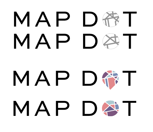
The final logo, a product of meticulous design, embodies the client's vision of a clean and contemporary aesthetic, harmonizing seamlessly with the message, "Put your business on the map."
To distinguish her brand from competitors, I conceived a distinctive color palette that set her apart in a crowded market. The logo I created featured map lines within a directional arrow, reminiscent of the markers seen on digital maps, thus perfectly encapsulating the essence of her business and its commitment to guiding clients towards success.
Logo Process
I began with some sketches, color palettes to choose from, and fonts to choose from. I typically begin with 50 sketches and the client narrows them down to 3 or 5 that we refine.
One of the challenges I ran into in creating an icon that looked like a map, was that if I created a grid like map I was in danger of having the logo associated with a certain hate symbol. In order to steer clear of this, I chose a highly populated area of New York City and looked for a pattern that would clearly differentiate itself as a map.
As part of the branding process, I created brand guidelines to instruct others in the future use of this logo and brand.
Having established a clear brand identity, the next phase involved the development of the website. To ensure its alignment with both business objectives and user expectations, I engaged in an extensive dialogue with the client. This process involved the completion of a comprehensive client brief, featuring inquiries designed to extract valuable insights regarding their business, target audience, desired demographics, and user behavior.
Collaboratively, we delineated the primary purpose of the website: serving as a robust lead conversion funnel. Keeping this objective at the forefront, I initiated the project by crafting a logical site map, ensuring a user-friendly navigational structure.
With the site map as our foundation, I engaged in strategic discussions with the client concerning content development, determining the placement of copy to maximize its impact. While the client focused on crafting the content, I concurrently developed a rudimentary wireframe, seamlessly integrating her copy into the evolving design framework. This synchronized approach aimed to deliver a compelling and cohesive user experience.
Upon securing the client's endorsement of the content and wireframe layout, the next phase entailed the development of a comprehensive, full-color prototype. Subsequent to the client's approval of this prototype, the project transitioned into the development stage. My preferred choice for website construction involves leveraging Content Management System (CMS) technology, and in this particular instance, I harnessed the capabilities of Wix to bring the client's vision to life.
To enhance the representation of the "creatives and copy" service points, I took the initiative to design custom icons. Given that conventional images failed to encapsulate the desired essence, I crafted minimalist icons characterized by clean lines, all while adhering to the brand's distinctive color palette. The outcome proved to be significantly more effective than relying on generic stock photography.
Strategically, I incorporated Call to Action (CTA) buttons at crucial junctures on each page, facilitating a seamless transition for users to reach the "Contact Us" section. Collaborating closely with the client, we meticulously crafted compelling copy that succinctly conveyed the essence of the business, its operational processes, client testimonials, and an informative FAQ section, strategically positioned below the contact form to address potential user queries and concerns.
In addition to content refinement, I also focused on ensuring the website's responsiveness. This involved meticulous optimization of the mobile version, guaranteeing universal accessibility across a variety of devices, thereby maximizing user engagement and interaction.
Results
The website design launch was successful and meeting an aggressive timeline made the client happy. I am continuing to work with the company on digital marketing projects to build on the new site and further optimize it, generate leads, and promote conversion.


